
 |
| Between 5 Bells label – top stuff |
Found – Australia’s most interesting rosé?
This article first appeared in January’s LatteLife Magazine. As usual the style here is a little more chatty and a little less analytical than is usual for this blog, but it deserves publishing here regardless (or at least I think so).
Rosé – that’s the sweet, bright pink coloured wine that you drink when on holidays yes? A less-than-serious wine style which is fun and refreshing but not really built for too much contemplation?
For the large part that’s a fair appraisal of many ‘typical’ Australian pink wines. Even the ‘traditional’ top Australian rosés – from makers like Turkey Flat and Charles Melton – can be a little on the simple side (though still enjoyable drinks).
Yet not for one rosé it’s not. One pink wine that is deliberately built to be – as winemaker (of sorts) David Fesq puts it – ‘dry, crisp, textured and moreish’. That wine is the Between Five Bells Geelong Rosé and it is, I’m not afraid to say, perhaps the most interesting rosé in the nation, even at a time when savoury rosé is well back in the spotlight.
What makes it so interesting you ask? How do you get a rosé to be moreish and textured?
Naturally it all starts with grapes and the 2011 Between Five Bells Rosé has no fewer than seven different varieties in the blend, including Pinot Noir, Shiraz, Grenache and Zinfandel, sitting alongside Chardonnay, Riesling and Muscat. You read correctly. White and Red grapes. It’s an eclectic blend indeed…
In the winery too this is not treated like a conventional ‘pink’ – more like a red wine actually – with the juice handled ‘oxidatively’ and treated with minimal additions of any kind (acid, yeast, sulphur etc all largely ignored) before maturing in old oak barrels before bottling.
Given this unusual treatment it’s probably of little surprise that it looks weird – it’s a little cloudy, a little orange and definitely not lipstick pink in colour. It looks weird, but the best thing is how it tastes – it is one of the oddest rosés around, immediately juicy but also dry and chalky, the white wine in the blend giving a wonderful peachy textural richness to the just strawberry fruit that is quite addictive. Odd perhaps, but addictive.
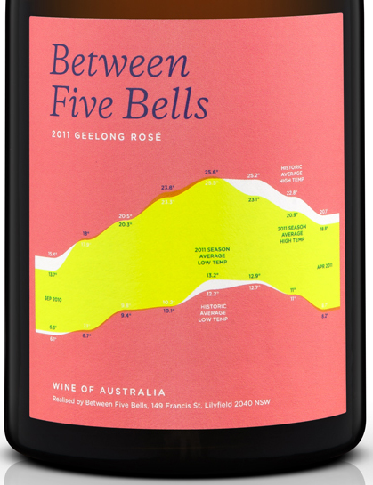
Finally, the label itself is a mindbender too, as they feature the infographic stylings of renowned designer Nicholas Felton with this particular wine featuring coloured bands around the bottle depicting (graphically) things like growing season temperatures, rainfall and the proportions of each grape in the blend. It’s the sort of label that will have you enthralled even once the bottle is empty.
Ultimately the joy with a wine such as this one is simply just how little compromise has been made. It’s a rosé made like it should be. Made without a cynical marketers hat in sight. Simply put, if you’re looking for the pinnacle of interesting Australian Rosé, this would be a great place to start.


Leave a Reply